Grade colour schemes not consistent over the app
The colour schemes used to depict different grade brackets are not consistent over the app: horizontal bar on crag main page, vertical grade bars and the grades of the individual routes in the route list.
Grade brackets in the lower grades are inconsistent (see tables below)
Route list has blue and yellow swapped
Overall colour scheme not optimal:
1) Not brand aligned: close to google colours. 2) Grade colours not aligned with cultural context or harmony, with blue in the middle of traffic light colours, gray indicating a lower value for grade 8…
Personally I think the current web/ old app grade colour scheme is perfect - why not use the same?
Horizontal bar
Vertical bars
Route list grades
Web/old app for reference:
Picture: inconsistent grade brackets between horizontal and vertical bars
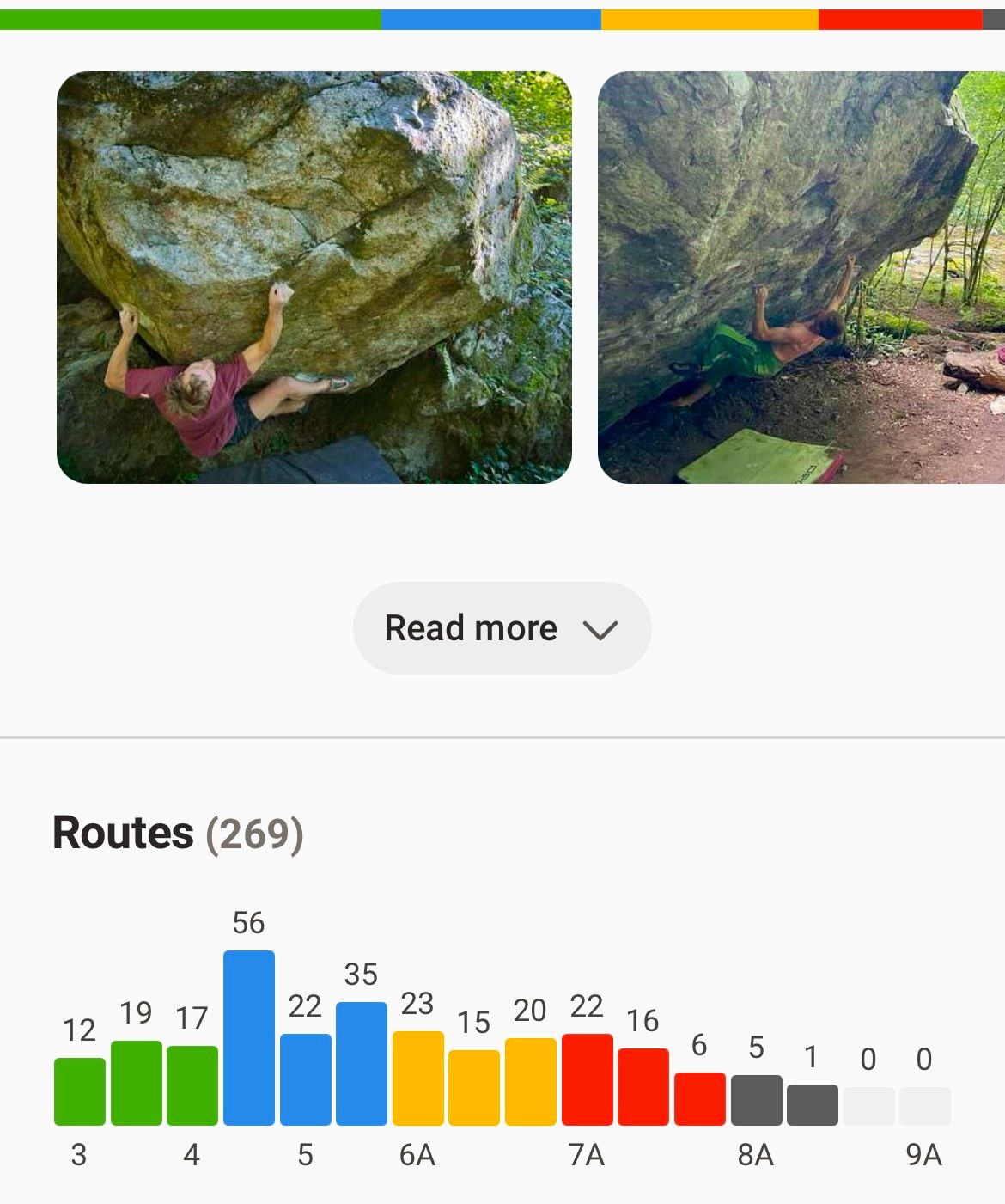
On another note, I like the horizontal grade bar - as a user I just need the colour scheme to be intuitive and consistent to understand it with a glance.
Status: Completed
No comments yet
Be the first to share your thoughts.