Sector titles and problem badges are hard to see sometime
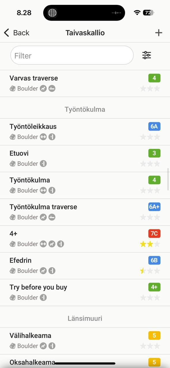
In the new app when you view an area in the list mode without filters items are divided into sections by sector. Those sector titles are light grey on white background which might be problematic for people with visual disabilities or when you use app in a bright environment. Same applicable to the problem badges (style, type of the item, etc).
Making them darker or increasing contrast any other way will fix the problem.
No comments yet
Be the first to share your thoughts.