Area location map view is very hard to use
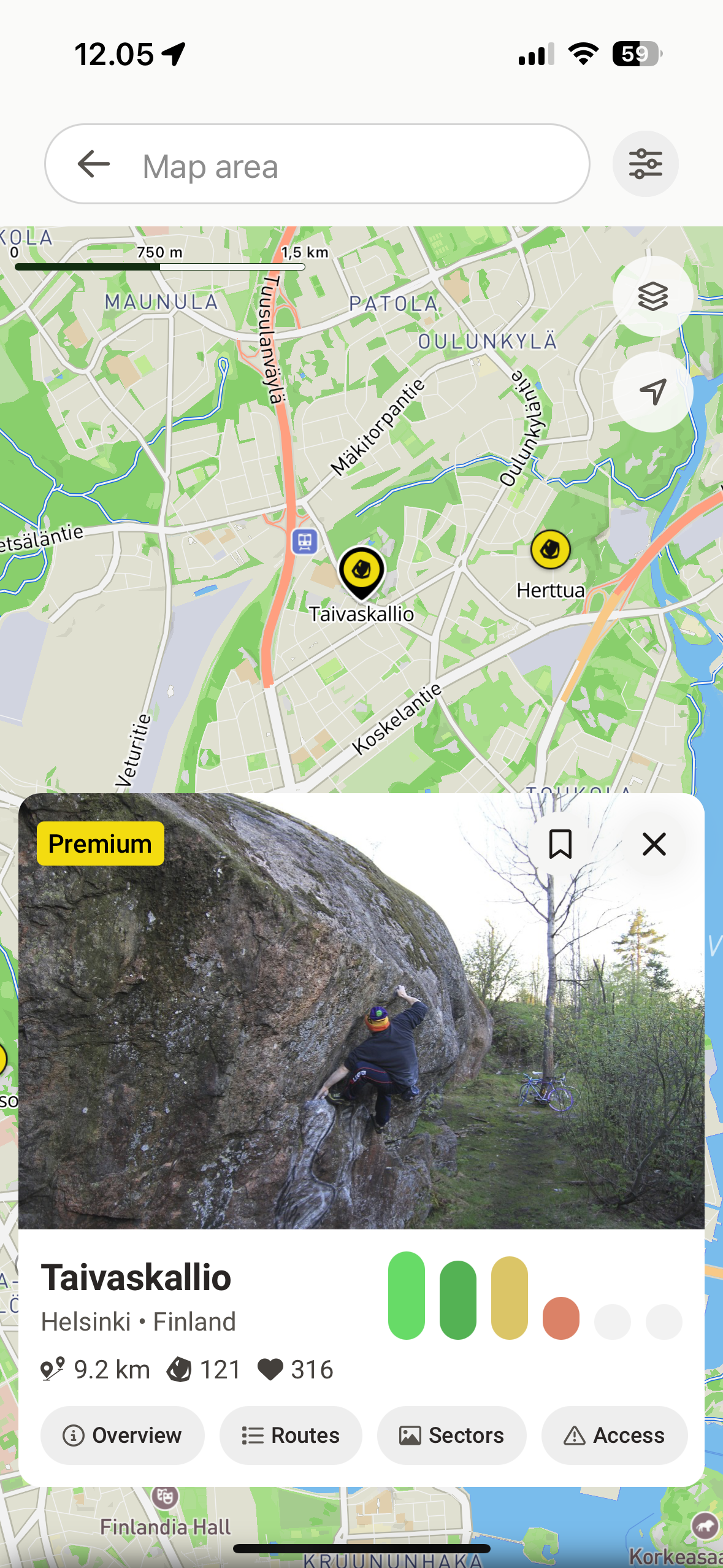
Map view that you are getting after taping on the Location on the area page is very awkward to use.
Most of the screen area is covered with search input and card with area description (considering that you just case from area page this seems to be an excessive information here), while you have very small area to interact with the map. First thing that comes to your mind is to close the card, but that leads to current state reset and you lose highlighted pin of the area you are exploring. Sometime pin of the area disappears at all.
Issues to address:
Map area is too small in this view.
Closing card leads to unexpected loss of focus on the area you are exploring and causing you to start flow from the very beginning.
Possible solutions:
a. Make card description smaller so user can interact with a map and get back to the area info quickly if needed.
b. Make it collapsable (e.g. replace close icon with collapse ‘⌄‘) that will squeeze card to collapsed state.
Example:
Comments4
Heikki Liukkonen
Apr 18, 2025
Losing the focus of the boulder as well as the “area perimeters” when swiping the details/description down is indeed very frustrating. Swiping down is the first thing coming into mind to get bigger map view - and now by doing this you have to search the boulder / location marker again.
Charlotte Ristiniemi
Oct 30, 2024
Have a look at the UX for the Boolder app for this. It is super smooth! It gives me Google maps premium experience
Alex Ivanou
Oct 23, 2024
One more issue related to this one.
In some cases (e.g. selecting a sector in the area topo page) maps opens with a card rendered over the pin of the selected area.
Steps to reproduce:
Select area with multiple sectors (e.g. Taivaskallio)
Tap on Topo
Tap on sector card
Map opens with card rendered over the active pin
Screenshot:
This one will be automatically resolved if any of the suggested fixes applied.
Sidenote:
Still quite skeptical about this flow in general since it makes area with multiple sectors really hard to use see separate issue: https://feedback.27crags.com/p/loop-in-a-user-flow-for-the-big-areas-with
Charlotte Ristiniemi
Oct 22, 2024
Plus one on this.
And for the second issue. I think that one solution could also be to have the “show curated sectors” always enabled as a default since i was going crazy over this until I understood I had to flip that filter.